Finding Our Visual Language (Part 2/)
by Holly on December 17, 2018
Holly here, and I'm back with a continuation of our previous artsy fartsy discussion.
Before jumping into pre-production, our team had already discussed some sources of visual inspiration. While Dyala and Zach were prototyping, I put together some very pretentious galleries to express different visual directions I was interested in exploring. I made a point to use minimal game art in my references, because I thought that using inspiration from different media would be the best way to create a more unique, less derivative, visual language for Project Thunder.
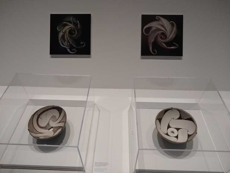
I’ve never been much of an art museum enthusiast, probably from being expected to enjoy them as an art-centric teen and being forced to endure them as an art college undergrad. That being said, there’s definitely something about seeing ancient ceramics and tapestries that appeals to the little fossil-hunting kid in me. And for the creative adult part, there was also some amazing visual languages to discover.
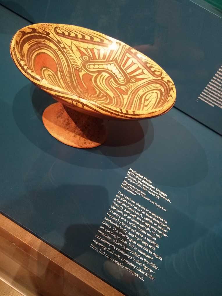
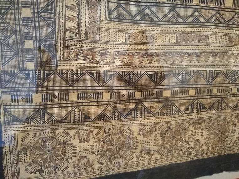
First, we checked out the Kuna Art from Panama. There were ceramics, textiles, and bits of stingray. But more so, the imagery the art used was a solid reference for the concept I’d been struggling with - childlike vs. childish representation (for more context, see the post titled Finding Our Visual Language (Part 1/).


Finding Our Visual Language (Part 2/)
by Holly on December 17, 2018
Holly here, and I'm back with a continuation of our previous artsy fartsy discussion.
Before jumping into pre-production, our team had already discussed some sources of visual inspiration. While Dyala and Zach were prototyping, I put together some very pretentious galleries to express different visual directions I was interested in exploring. I made a point to use minimal game art in my references, because I thought that using inspiration from different media would be the best way to create a more unique, less derivative, visual language for Project Thunder.

I’ve never been much of an art museum enthusiast, probably from being expected to enjoy them as an art-centric teen and being forced to endure them as an art college undergrad. That being said, there’s definitely something about seeing ancient ceramics and tapestries that appeals to the little fossil-hunting kid in me. And for the creative adult part, there was also some amazing visual languages to discover.
First, we checked out the Kuna Art from Panama. There were ceramics, textiles, and bits of stingray. But more so, the imagery the art used was a solid reference for the concept I’d been struggling with - childlike vs. childish representation (for more context, see the post titled Finding Our Visual Language (Part 1/).
