Adventures in Font Hell
by Holly on March 01, 2019
Holly here again to talk about fonts. More specifically, our journey to Font Hell and back.
Most UI artists and indie devs know about Font Hell. It’s the one to a billion hours a developer spends looking at slightly different fonts to find THE ONE that is the perfect balance of mood, legibility, style range, licensing cost, and localization support. Font Hell is where teams are broken and game visions go to die. Alright, maybe that’s an over-exaggeration, but choosing fonts is incredibly important, especially for small productions with small budgets and big dreams.
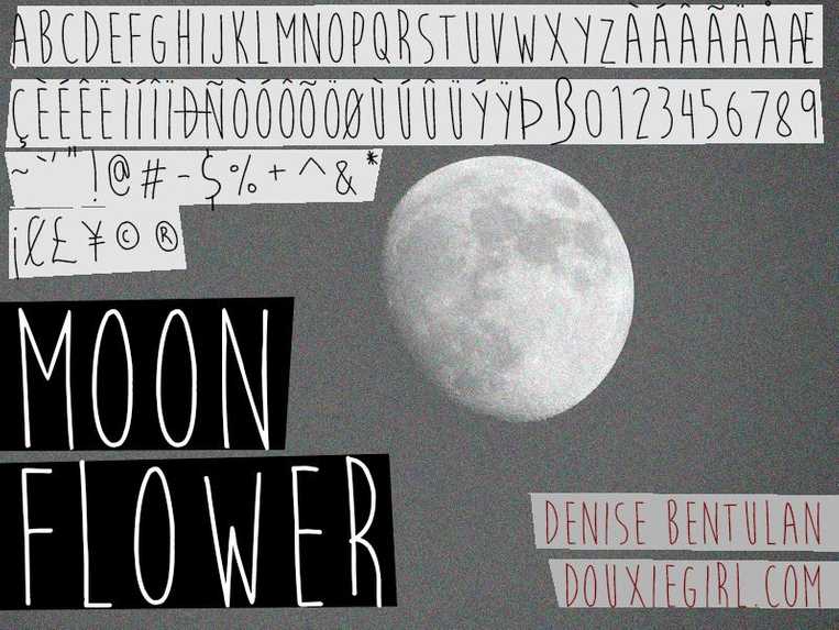
For Signs of the Sojourner, I spent the better part of 3 days looking through fonts online. Lucky for me, we put localization on the backseat for now, so if we ever need support that’s a bridge we’ll cross when we get there (see this Hearthstone GDC talk and learn about the transformative concept "design for now" no this is not an ad). Even with this advantage, I ended up narrowing our potential font pools by a large margin because I wanted a hand-drawn look to match the rest of our aesthetics. The main issue with that is many handwriting fonts are lacking in the support and legibility departments.
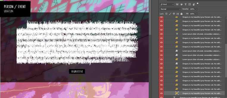
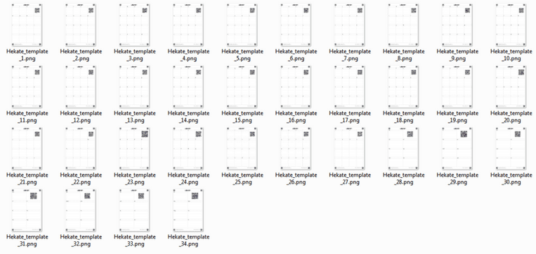
Just kidding, I REFUSED TO MOVE BACK TO FONT HELL. I jumped on one of those websites for making your own handwriting into a font and spent a day or so creating test fonts. Eventually, we paid the $8 to expand our font and did a few passes to support math symbols and extended punctuation. Looking back, maybe this was just a different kind of hell?

Adventures in Font Hell
by Holly on March 01, 2019
Holly here again to talk about fonts. More specifically, our journey to Font Hell and back.
Most UI artists and indie devs know about Font Hell. It’s the one to a billion hours a developer spends looking at slightly different fonts to find THE ONE that is the perfect balance of mood, legibility, style range, licensing cost, and localization support. Font Hell is where teams are broken and game visions go to die. Alright, maybe that’s an over-exaggeration, but choosing fonts is incredibly important, especially for small productions with small budgets and big dreams.
For Signs of the Sojourner, I spent the better part of 3 days looking through fonts online. Lucky for me, we put localization on the backseat for now, so if we ever need support that’s a bridge we’ll cross when we get there (see this Hearthstone GDC talk and learn about the transformative concept "design for now" no this is not an ad). Even with this advantage, I ended up narrowing our potential font pools by a large margin because I wanted a hand-drawn look to match the rest of our aesthetics. The main issue with that is many handwriting fonts are lacking in the support and legibility departments.


Just kidding, I REFUSED TO MOVE BACK TO FONT HELL. I jumped on one of those websites for making your own handwriting into a font and spent a day or so creating test fonts. Eventually, we paid the $8 to expand our font and did a few passes to support math symbols and extended punctuation. Looking back, maybe this was just a different kind of hell?
